summary review - what happened
what happened - political/market trends
key themes, emerging trends
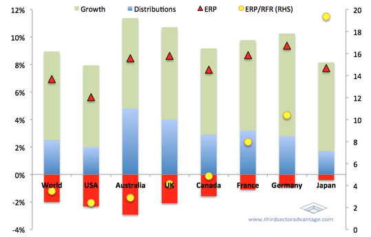 Chart A: Forecast Total Returns, unadjusted for risk
As investors it's easy to gravitate toward
Chart A illustrates how this concept works in practice: here we see the components of return from the equity markets across major developed markets, where the red triangle - ERP (Equity Risk Premium) - indicates the approximate level of compensation an investor demands for purchasing equity instead of government treasury bonds. In addition, the yellow dots show how this ERP compares to treasury bonds.
These two markers work in tandem with each other to provide an insight into the anticipated risks, growth prospects and stability of markets. Of course a high ERP provides
how do things look at the moment
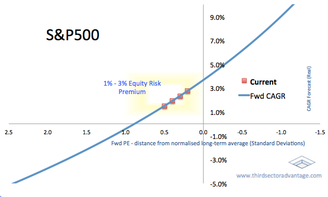
The difficulty from here is that equity markets are more or less fully valued; that is to say, they're neither ridiculously overvalued, nor undervalued. For investors this makes portfolio management decisions considerably more difficult.
The S&P500, for example, is currently trading on a forward Price-Earnings ratio of around 0.2 to 0.5 standard deviations above it's historical average, suggesting the index is roughly 4% more expensive that it's long-term average. Similarly, compared to long-run averages, it's CAPE ratio is around 7% overpriced, Price to Book is 5% overvalued, and Price to Cash Flow around 3% overvalued. Of course these metrics in and of themselves don't tell us much: after all, a 5% or 10% fluctuation from an arbitrary long-term average does nothing to help predict short term returns or volatility.
However that doesn't mean this analysis is completely unhelpful. For example, using the S&P500 again, we know that the underlying earnings (and profitability) of the companies within the index
So, if markets are (more or less) fairly priced, then where does that leave us?
Well, to start with it's helpful to appro
lookout - what is on our "watchlist" -- Iran, oil supply/nuclear, credit/capital requirements etc
portfolio / market positioning
what we are looking out for in the months ahead / where do we see opportunities